


What does Accessibility Mean?
Accessibility is the “practice of making information, activities, and/or environments sensible, meaningful, and usable for as many people as possible.” For UI and digital design this means making sure that interfaces and content is navigable and digestible for anybody with mobility, vision, or other issues. This is an example of a link, for styling purposes.
What is impact?
People exist on a spectrum of ability. Accessibility simply lets your design benefit the largest number of users possible. It keeps everyone in the conversation despite differences in ability.
An inclusive approach to information and idea sharing increases the quality of everyone’s life. Design itself is improved when it considers a wider audience of users.
1. All buttons need to be 44px or larger
Clickable and interactive content needs to have a minimum hit area of 44px tall and wide.
This helps to ensure that people with mobility issues are able to properly interact with your content. People in general tend to be less accurate with a cursor than a finger, however, a finger blocks the user’s view of the clickable object. Therefore, a minimum hit area is required to be accessible. Note: Inline links are exempt from this rule.

2.
Text needs to have a high contrast against backgrounds.
Text smaller than 18pts 4.5:1 AA 7:1 AAA Text 18pt or larger 3:1 AA 4.5 AAA
Text that is not decorative needs to have a high enough contrast against its background so people with low vision can read it. There are free tools available that allow you to check the contrast ratio of two colors in your design. For example, a contrast ratio of 4.5:1 is the minimum to pass AA accessibility.
Note: Text within logos does not need to pass.

3. Don’t use only color to inform
Color cannot be the only point of difference to differentiate important information.
Users who are color blind or who may not be able to see color well, look for other visual cues other than color. These cues can take the form of different shapes, icons, text, or underlines.
In addition, the color needs to pass a 3:1 contrast ratio against the background.
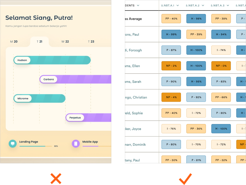
The first image shows how only color is used to categorize content which makes it hard for color blind users. The second image show how text and color are used so all users can differentiate the categories of content.
4. Add descriptive text for images
Important images need meaningful descriptions added to their metadata or alt text.
Some people require assistance with screen readers to help experience visuals that they have trouble seeing. Important images need to have meaningful descriptions in order for screen readers to dictate effectively to those users. Bonus: this will also help your SEO.
Note: Decorative images do not require descriptions. An example of a decorative image is a background hero image that doesn’t convey a message.

An example of a bad image description would have a screen reader say "IMG_5723947.png" whereas a better, meaningful description would say something like "Father carrying son over Care.com floral shapes"
5. Label all of your form controls
Form controls need a clear label that persists after interaction. Some examples of form controls are input fields, dropdowns, checkboxes, radios, and toggles.
Users need to be able to understand what they’re interacting with before and after interacting with a form control. This also ensures that assistive technology can refer to the correct label when presenting a form control.
Note: A tooltip can also work as a label, however it is not recommended as some screen readers can miss them.
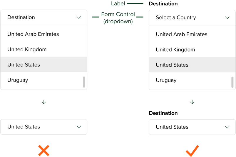
In the left example, the purpose of the dropdown is lost after selecting an option. In the right example, the label above the dropdown keeps the purpose of the dropdown clear after making a selection.
Thank you for reading!
If you'd like, you can download a mini checklist for your site here.