A father carrying his son with vibrant floral graphics in the background.

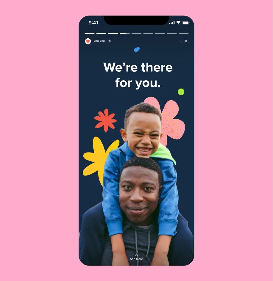
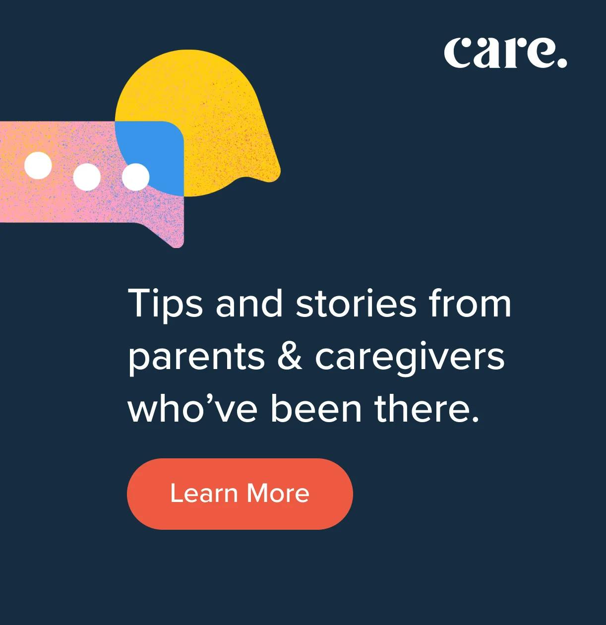
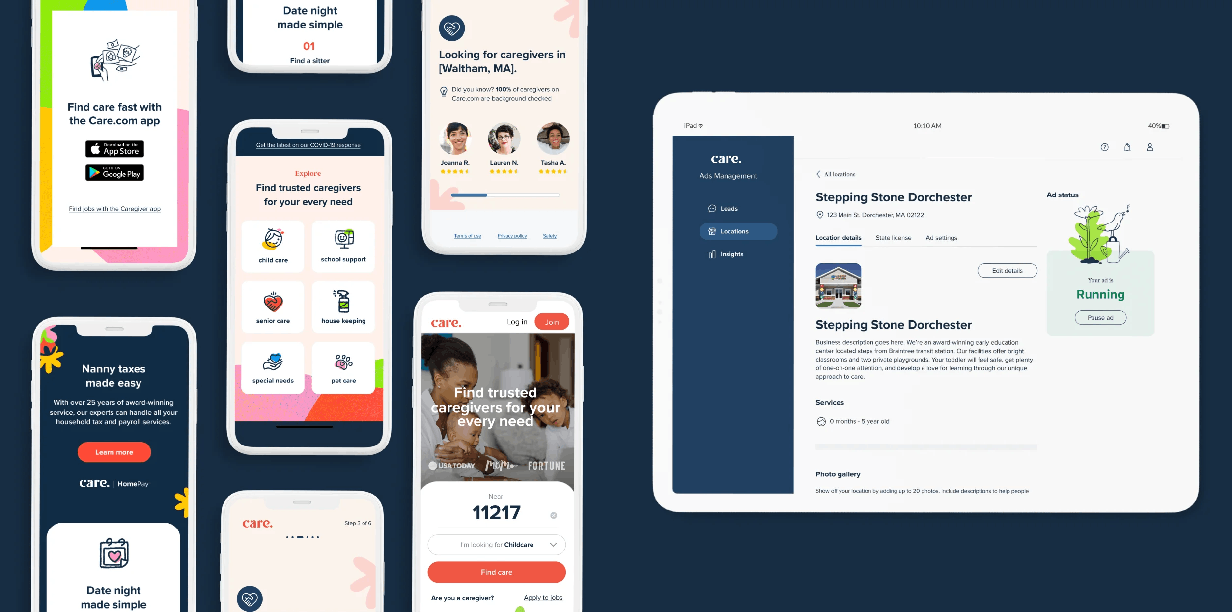
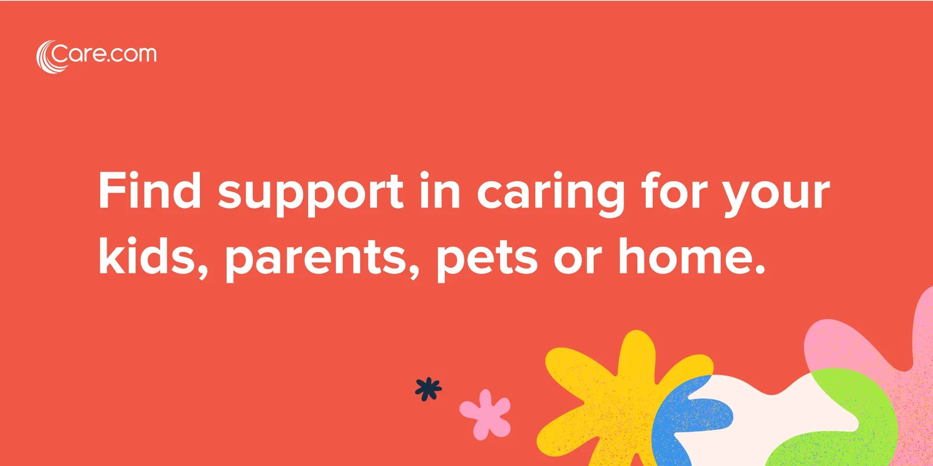
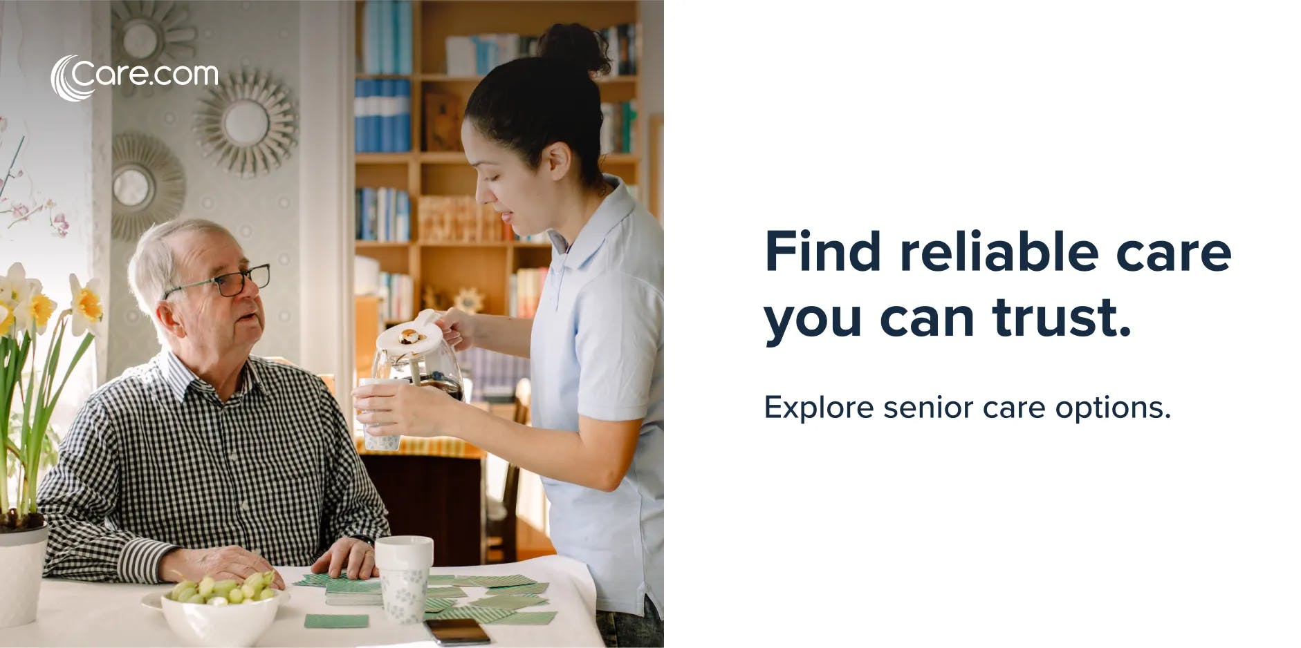
As a service that connects families to care providers, security and peace of mind was a top priority for Care.com when they approached us for a brand redesign. Our new branding system communicates trustworthiness along with warmth and dedication to the families in the Care network using an expressive mix of bold shapes, clean typography, minimal iconography, custom hand-drawn illustration, and customer-centered UI design. The design introduces a new color palette as well as the use of texture to give it warmth. These elements pair together to create a distinctly friendly and reliable brand identity, reflecting the vibrancy of being a modern family!

Floral and organic shapes in Care.com's colors and textures.
A young blonde girl wearing sunglasses and hands on her hips, on a background of overlapping colors and shapes.
Icons for Care.com depicting childcare, cleanliness, etc.

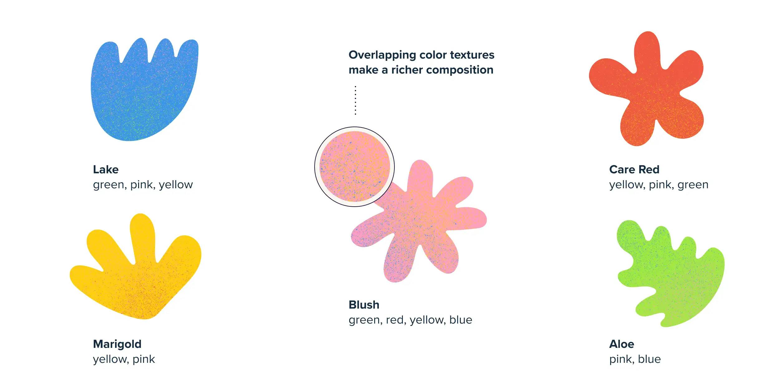
ICONS AND ILLUSTRATIONS

OrangeYouGlad designed a library of icons for Care.com that captured key service areas in the approachable new design style. Additionally we established a style for spot illustrations.

Mobile mockup for Care.com social featuring a father carrying his son with "We're there for you." text
Example of a social graphic with speech bubbles and text "Tips and stories from parents & caregivers who've been there." and button that directs to "Learn More"
Layout of various mobile and desktop screens for the Care.com website
Graphic with text "Find support in caring for your kids, parents, pets or home."
Layout for Care.com for senior care. A worker is pouring coffee for an older man at a table with fruit and playing cards. The text paired with the image says "Find reliable care you can trust. Explore senior care options."